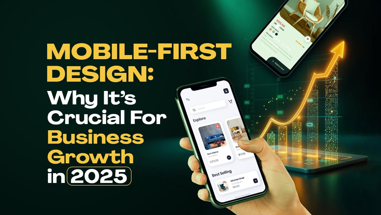
Mobile-First Design: Why It’s Crucial for Business Growth in 2025
David here 👋 , a frontend developer with 6+ years of professional experience and 9+ years (est. 2015) of overall software development experience.
I love to inspire, empower and connect with the Dev community by sharing knowledge through writing, YouTube, speaking engagements (DM to request) and social media.
Let’s be honest—when was the last time you opened a laptop just to Google “best food near me”? You don’t remember right? Exactly, these days, even your grandma is ordering waakye (Waakye is a ghanaian dish made from rice and beans**) through her phone.
So, if your business website is still acting like it’s allergic to small screens, we need to talk. Seriously.
Welcome to 2025, where mobile-first design isn’t just a trend. It’s survival.
But Wait—What Exactly Is Mobile-First Design?
Let’s break it down.
Mobile-first design simply means designing your website or app for mobile users first (instead of desktop) and then scaling it up for bigger screens.
It’s like building a kiosk first, before you think about turning it into a supermarket. You focus on the essentials, make them sleek and functional, and then you expand.
And trust me, this mindset? It’s changing the game.

When your site finally works on mobile and you feel like a UX god
Why Should Businesses Care?
1. Most People Are on Their Phones Everyday
As of February 2025, mobile devices account for approximately 62% of global internet traffic.
Wikipedia – Web browser
So if your site is dragging or breaking on a phone, a whole bag of potential customers are gone. Just like that.
2. Better User Experience = More Sales
People stay longer and buy more on websites that are smooth on mobile.
That confusing menu or tiny text that needs a microscope? It could be the reason someone exits and never comes back.
3. Google Likes Mobile-Optimized Sites
Mobile-first indexing is a thing now. Google prioritizes mobile versions of websites for ranking.
Google Search Central – Mobile-First Indexing Best Practices
So if you want to show up on the first page of search results, then your mobile design needs to be solid.

That moment your site ranks #1 and you suddenly acts like you just won the lottery
4. It Forces You to Focus on What Actually Matters
Designing for mobile first forces you to cut the noise.
No unnecessary animations, no 4 pop-ups and 3 carousels on one screen - just a clean, functional, focused design.
5. It Future-Proofs Your Brand
Tech keeps evolving. Screens will only get smaller, faster, and smarter.
Mobile-first is your cheat code to staying ahead of the curve. The brands doing this now? They’ll be the ones thriving in 2026 and beyond.
So, what’s the play?
Simple:
Design for mobile first, not as an afterthought.
Test every feature on your phone before calling it “done.”
Work with developers (like Dave) who get it and build for the real world.
Ready to Build a Website That Works on Any Device?
If your current website still acts confused when opened on a phone, it’s time to call for Help.
👉 Visit KingDavidGyimah.com, drop a message and let’s help you build a responsive, fast, and user-friendly website that actually works in 2025 (and beyond).
Because what’s the point of having a beautiful site… if it breaks on your customer’s iPhone 14? 😂